 Tony Finch – blog
There’s plenty of material online about the bewildering variety of keycaps, eg, eg, but I learned a few things that surprised me when working on Keybird69.
nightfox
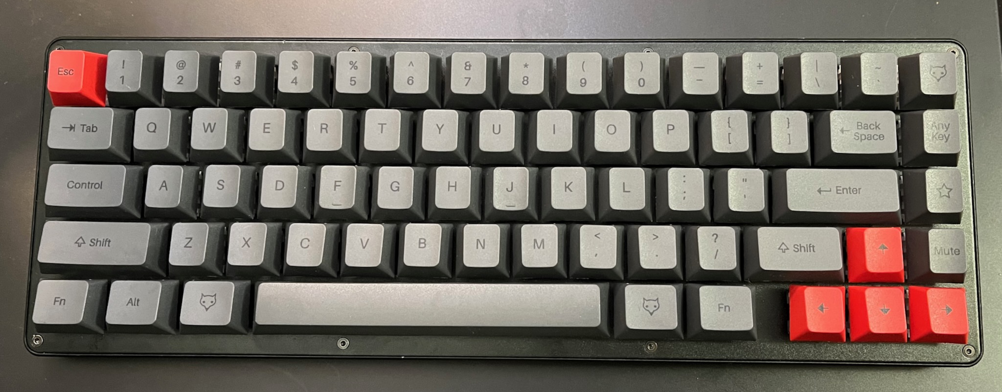
I found out that the remaining stock of Matteo Spinelli’s NightFox keyboards were being sold off cheap because of a manufacturing defect. I grabbed one to find out what it’s like, because its “True Fox” layout is very similar to the unix69 layout I wanted.
My NightFox turned out to have about three or five unreliable keyswitches, which meant it was just about usable – tho the double Ts and unexpected Js rapidly became annoying.
But it was usable enough that I was able to learn some useful things from it.
legibility
The black-on-grey keycaps look cool, but they are basically illegible. (The picture above exaggerates their albedo and contrast.) This is a problem for me, especially while I was switching from the HHKBeeb ECMA-23-ish layout to an ANSI-ish TrueFox-ish unix68 layout.
Fortunately I learned this before making the mistake of buying some fancy black-on-grey keycaps.
up arrow
I had seen a few keycap sets with extra up arrows, which puzzled me (For example.) The NightFox came with an extra up arrow, and eventually I twigged that it makes the profile of the arrow cluster a bit nicer.
Usually, in a sculpted keycap profile (where each row of keycaps has a differently angled top surface) the bottom two rows have the same angle, sloping away from the typist. This means the up arrow key slopes away from the other arrows on the row below.
The extra up arrow keys typically match the tab row, which is flat or angled slightly towards the typist. This gives the arrow cluster a more dishy feeling.
Unfortunately the keycaps I ordered do not have extra up arrow keys with tab row angle as an option. I did not realise until after I ordered them that I could have got a similar effect by using a reversed down arrow as an up arrow – it makes a sharper angle, but still feels nicer. So I’m using a reversed arrow key for Keybow69’s up button and my up/down legends both point the same way.
right column
Some keycap sets have multiple page up / page down / home / end keys with different row profiles so that people with 65% and 75% keyboards can rearrange the right column of keys. (For example.)
Instead of the superfluous navigation keys, I used the NightFox novelty keycaps on my keyboard. (You can see the ANY KEY, the cute fox logo, etc. in the picture above.) These all had a top row profile, and at first I thought this was an ugly compromise.
But it turns out that the difference in height between the right column and the main block of keys is really useful for helping to keep my fingers in the right places. It makes me less likely to accidentally warp a window when I intend to delete a character.
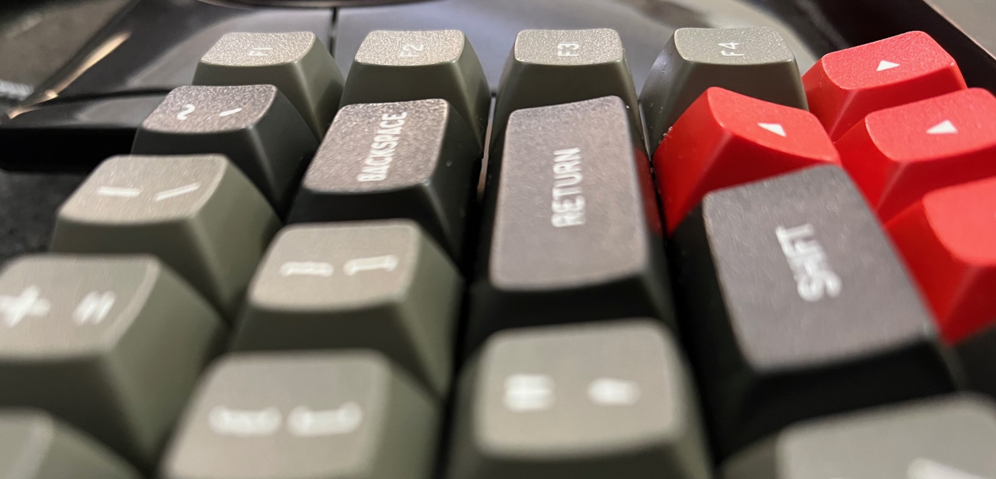
The mismatched angle of the up arrow key is similarly helpful. Matt3o added a gap next to the arrow keys in his True Fox design to make the arrow keys easier to locate, but I think that isn’t necessary with an out-of-profile up arrow (which is also one of Matt3o’s favourite features).
profile
I previously thought I wanted a uniform keycap profile (e.g. DSA like the keycaps that came with my Keybow 2040) but these discoveries taught me a sculpted profile is more practical for the keyboard I was making.
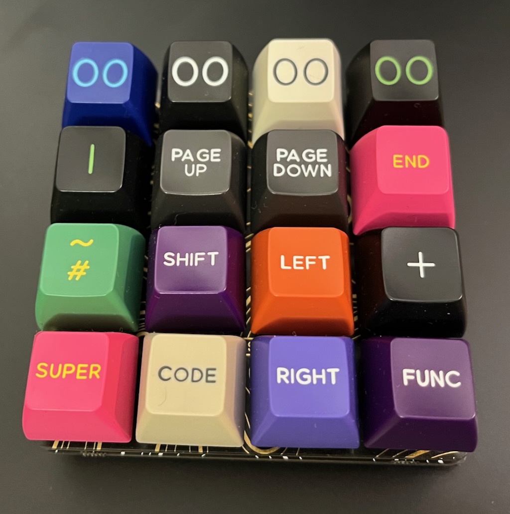
Another research purchase was a grab bag of random surplus keycaps, which is about as useless as you might expect: hundreds of keycaps, but too many duplicates to populate a keyboard. (My Keybow 2040 now has a very colourful mixture of miscellaneous keycaps.) The grab bag I got was mostly SA profile, which is tall and steeply angled on the near and far rows. In their normal orientation, SA function keys would probably not work so well on the right column of my keyboard, making a shape like a warehouse roof. Maybe they would work when rotated 90°? Dunno.
One of my old beliefs remained: I still prefer spherical indentations in the tops of my keycaps. They are more cuddly around my fingertips than the more common cylindrical indentations.
Annoyingly, many of the newer sculpted spherical keycap sets are hard to get hold of: often the only places that have them in stock will not ship to the UK at an affordable price. (For example.) Also annoyingly, the cheaper keycap sets almost never have the extras needed for unix69 compatibility. Bah.
collection
The black-on-grey NightFox keycaps are Cherry profile (cylindrical indentations, sculpted rows, very short), and the keycaps that WASD printed for my HHKBeeb are OEM profile (like Cherry profile but taller). The HHKBeeb doesn’t have spherical keycaps because I don’t know anywhere that will do affordable one-off prints other than OEM profile. I also have a set of TEX ADA keycaps (uniform rows, short) which have lovely deeply scooped spherical tops, tho I am not a fan of their Helvetica legends.
So instead of a set of DSA keycaps (DIN height, spherical top, uniform) as I originally planned, I got DSS keycaps (DIN height, spherical top, sculpted). I love the Gorton Modified legends on Signature Plastics keycaps: as a business they descend from Comptec who made most BBC Micro keycaps.
I think Matt3o’s MTNU Susu keycaps are closer to my ideal, but I missed the group buy period and they have not been manufactured yet. And I wish they had an option for icons on the special keys instead of WORDS. I suspect the MTNU profile will become very popular, like Matt3o’s previous MT3 profile, so there will be chances to get some in the future.