"Flat" has become very popular.
This particular design trend found its footing in Microsoft's Windows Phone 7 design. It was all big, buttons and bright colors with no extraneous texture or ornamentation—ideas that later spread to Windows 8, iOS 7, OS X Yosemite, the Android L release, and many apps running on those platforms. Software is no longer focused on making onscreen content look like real-world objects. Our screens aren't made of felt or paper, so why should they look that way?
That said, there are plenty of things about older designs that new designs haven't figured out. We put our collective heads together and came up with the following list of modern UI design trends that get our blood boiling. We're sure there are more things that could make this list, but we're trying to keep our blood pressure down. If you've got some hate to spread around, kindly deposit it in the comments section.
Too-flat, text-only "buttons"
One of the common UI elements ushered in by iOS 7 is the button that doesn't look like a button at all (and Google is moving in that direction with the Android L release). Touch-oriented interfaces tend to be a little too subtle about how to navigate them to begin with, but iOS's new favorite trick of making the thing you're supposed to click into highlighted, or sometimes not-highlighted, text means I'm prodding at my screen a lot more often now with too little or too much to show for it. And because the OS isn't consistent about how it identifies buttons, I can't build a reflex in response to certain colors or fonts. I'm always experimentally clicking around and sometimes ruining things.
Daring Fireball highlighted this problem a while ago with the short-lived blog UX Critique, which pointed out that a number of UI elements in iOS 7 are buttons masquerading as text, and sometimes vice versa. The blog shows, for instance, a screen for editing an audio file where the world "Trim" appears twice, one is a button, one is a title, and the only difference between them is one's text is just a hair thicker.
Tapping text took some getting used to, as there is no consistent coded color to distinguish it as a button, but I'm finally making peace with it. Possibly worse, though, is the lack of consistency in how the OS highlights a button that is tapped. I'm looking at you, shift key.
—Culture Editor Casey Johnston
A dearth of density
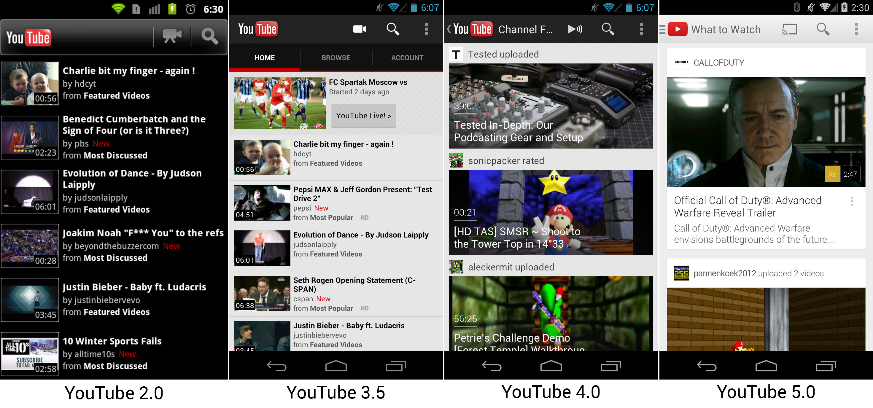
Modern operating systems are all about letting content breathe, optimizing things for touchscreens, and making sure that spacing is uniform and stuff. This is fine... but all of it comes at the expense of information density. The picture above from our Android History article demonstrates how the YouTube app has evolved over the years. While early versions of the app are pretty heinous, later versions can barely show one video onscreen at a time.
This trend is common in other places too. Tweetbot 3 shows less on screen at once by default than Tweetbot 2. iOS 7 folders on an iPad can only show nine items at a time, down from 20 in previous versions (granted, folders in iOS 7 can hold infinite items across multiple pages while iOS 6 folders were capped at 20). Watch how the Gmail app spreads out when it's reformatted according to Google's Material Design guidelines, and you'll see what I mean. Things generally look nicer, but you're reducing the number of items I can see onscreen at one time even as device screens balloon up to near-tablet sizes. Surely we can find ways to make things look good without introducing so much extra scrolling?
—Senior Products Specialist Andrew Cunningham
Excessive translucency

While a lot of different interface decisions aim to reduce the information density on screen, there's another one that Apple's especially fond of that makes it harder to understand the information at hand: translucency. To be clear, OS-X started with a lot of translucency (as well as some pin stripes), but both of those were being toned down over time for good reason. They create visual clutter, making it harder to focus on the information you actually want. (Like, say, the menu command you're attempting to locate.)
But Apple never really got over its thing for translucency, and it has only sporadically reversed course. In Leopard, they made the menu bar translucent, which allowed the menu to blend in nicely to whatever image you were using on your desktop. Unless you had a dark desktop background. Then it nicely made it impossible to read the menu commends. So Cupertino backed down, and allowed users to disable it.
Now translucency is back and, well, everywhere. Any window, depending on the developer's whims, can be translucent and blend into the background. This means that users will be at the mercy of developers, who will get to determine whether the information the user wants to focus on stands out from the background or gets buried in visual clutter from whatever it is that happens to be in the background.
Apple's developed a bit of a dictatorial reputation because it makes decisions on behalf of developers. It makes those decisions to ensure a visual consistency and because the company feels that, left on their own, developers will make some interface decisions that are really user-hostile. Now, with the optional translucency, the company seems to just be saying "ah, screw it, do whatever you want, and who cares about the users."
—Senior Science Editor John Timmer
Menus that can't turn off the Caps Lock
The invasion of ALL CAPS MENUS in Microsoft’s current-generation applications and operating systems is LITERALLY TERRIBLE. Other than making the text white-on-white, there isn’t really anything Microsoft could do to so massively decrease readability. The Visual Studio design group posted some lame handwaving a few years ago on why all caps is the way to go, which essentially came down to a mix of "It makes the menu more visually distinct" and "All the other Microsoft applications are doing it."
Seriously: "On the first point, the use of uppercase text is becoming a strong signature element of styling for navigation and headings in Microsoft user interfaces."
As justifications go, this is ludicrous. Sure, there are ways to fix the menu for some applications so that it’s correctly displayed in sentence case, but there’s no universal fix. Like translucency and crappy typography, an ALL CAPS MENU is an awful design choice that actively impairs usability.
Worse, it’s leaking onto other operating systems: Microsoft’s recent release of OneNote for OS X is cursed with insane, non-standard application window menus IN ALL CAPS that doesn’t so much violate OS X’s design conventions as it does take them out behind the shed, pour gasoline on them, and set them on fire.
Microsoft: what the hell is wrong with you? Fire the person who thought ALL CAPS was a good idea.
—Senior Reviews Editor Lee Hutchinson
Listing image by Andrew Cunningham
reader comments
310