


The EU referendum was, for many people, a referendum on immigration. A survey conducted on behalf of Lord Ashcroft shortly after votes had been cast, showed that 33% stated their main reason for voting Leave was because it “offered the best chance for the UK to regain control over immigration and its own borders”. In addition, 81% of Leave voters regarded multiculturalism and 80% regarded immigration as “forces for ill”, compared to 19% and 20% of Remain voters respectively.
But our new analysis for this article shows that, in most cases, high proportions of Leave voters were not concentrated in areas of high immigration. Apart from a few outliers, the districts with the highest vote for Leave were those with the lowest levels of immigration.
Perception v reality
It has long been observed by commentators in the media and in academia that areas where residents are most likely to oppose immigration – such as Thanet, where Nigel Farage campaigned for parliament in 2015 – tend also to have the least direct experiences of it.
Areas with a predominance of anti-immigrant sentiment are commonly characterised by long-term structural factors, resulting in low wages, low levels of education and high unemployment, alongside relative ethnic and cultural homogeneity. The think-tank Demos, in research on attitudes towards immigration and multiculturalism among “majority” white British communities, argued that contact with migrants and members of ethnic minority communities “takes the edge off negative perceptions”, something reinforced by assimilation: “a significant share of the children of European immigrants and some of mixed-race background come to identify as white British, melting into the majority.”
In an effort to better understand the relationship between the extent of immigration experienced by an area and voting in the EU Referendum, we have done an initial analysis of the referendum data, available from the Electoral Commission, and compared it with economic data from the Labour Force Survey and population data from the 2011 Census. There has been more migration since the last census, but more up-to-date estimates are not available at a local level.
Leave vote higher in areas with low immigration
The graph below shows the proportion of Leave votes for all local authorities in England and Wales (on the vertical axis) against the proportion of residents who stated that they had been born outside the UK in the 2011 census (on the horizontal axis). It shows that high proportions of Leave voters were overwhelmingly more likely to live in areas with very low levels of migration.
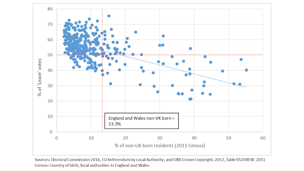
Across all districts, the average percentage of the population born outside the UK was 13.3% – this is indicated by the vertical red line. The horizontal red line shows the 50% divide between Leave/Remain win by district.
Of the 270 districts that had a lower proportion than average of people born outside the UK in 2011, in 229 (85%) the majority vote was for Leave. Of the 78 districts with a higher than average population born outside the UK, only 44% voted Leave.
Boston in Lincolnshire, which experienced the highest rate of increase in residents born outside the UK between the 2001 and 2011 censuses (an increase of 467%) and had the highest proportion of Leave votes in the referendum, is an example of an outlier. Residents born outside the UK accounted for 15.2% of the population, above the national average, while 75.6% voted for Leave.
Boston aside, the chart below shows other districts with very high proportions of Leave votes – the majority of which have a low percentage of the population not born in the UK.
As the graph below shows, and in line with The Guardian’s demographic analysis, the lowest Leave votes were mainly in urban areas with high non UK-born populations, in London boroughs and several university cities.
The whole story?
The Guardian’s analysis, along with polls by YouGov and Lord Ashcroft, also found that voting was correlated with district-based profiles of age, education (in particular, having a degree or not), income and social class (albeit with some outliers). High proportions of Leave votes were observed in districts with an older age profile, lower proportions of residents educated to the equivalent of a degree, lower median earnings and lower proportions employed in highly skilled occupations.
An article for The Conversation by social researcher Ralph Fevre explores relationships in more detail between attitudes towards immigration with education, quality of work and social exclusion.
Labour Force Survey data for Sunderland, a district with an unexpectedly high Leave vote, showed unemployment at 8.5% as well as a lower than average percentage of the population employed as managers or professionals and a lower proportion educated to a degree level or higher. There is a similar picture for many of the leading Leave districts.
But deprivation by itself did not explain the Leave vote, as the results in London show. It was where those socio-economic characteristics occurred in places with a predominantly white British population, that the Leave vote was strongest. So where migrants were not present, it appears they were held partly to blame for the all-too-real, but much deeper-seated, economic difficulties experienced by locals.