
THE DOVES TYPE®
¶ Robert Green’s facsimile of the famous Doves Press typeface, a digital reconstruion devised using the original metal type salvaged in 2014 from London’s River Thames.
THE DOVES PRESS WAS FOUNDED IN 1900 by T. J. Cobden-Sanderson, in partnership with process engraver & photographer Emery Walker, in Hammersmith, London. During nearly seventeen years of operation, the Doves Press produced some of the finest & most notable examples of twentieth century typography.
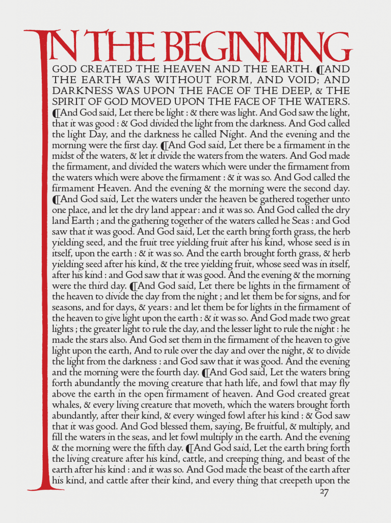
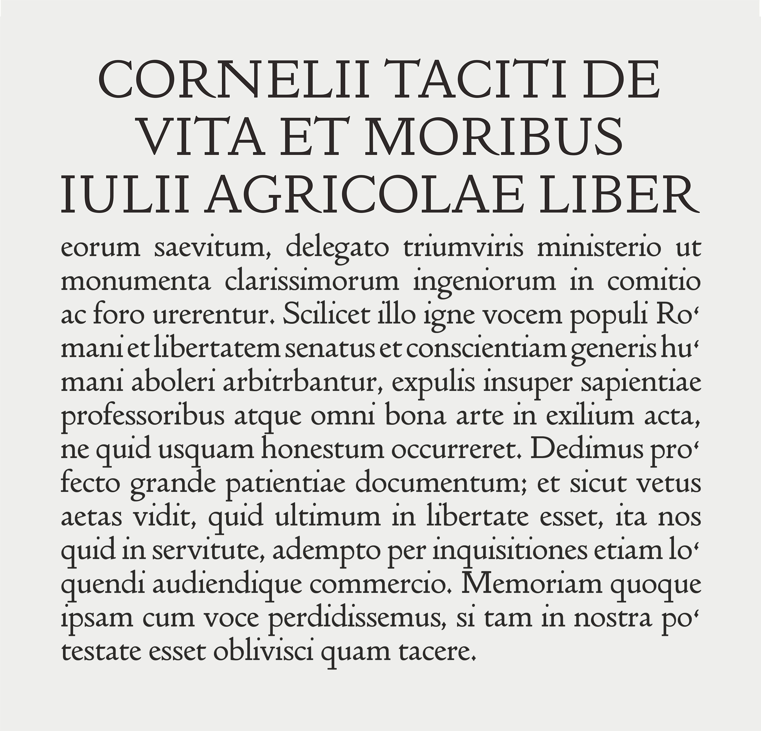
The distinguishing & most celebrated feature of its books was a specially devised fount of metal type, known variously as Doves Roman, the Doves Press Fount of Type, or simply the Doves Type.
When the partnership was formally dissolved in 1909, a settlement was proposed whereby the two men would share the type; Cobden-Sanderson could retain its exclusive use to continue printing Doves Press publications until his death, whereupon ownership would then pass to Walker.
Nonetheless, after the Doves Press was closed in 1917, an epitaph appeared in the press’s final publication announcing that Cobden-Sanderson had ‘bequeathed’ the type to the bed of the River Thames. Read more about the Doves Type history.
¶ Recovering the sorts from the Thames & finessing the digital font:
In 2013, after three years of research and drawing, Robert Green released a facsimile font of the lost Doves Type through Typespec. However, following the acquisition of a greater range of archive material in 2014, Green began to update his digital version of the typeface.
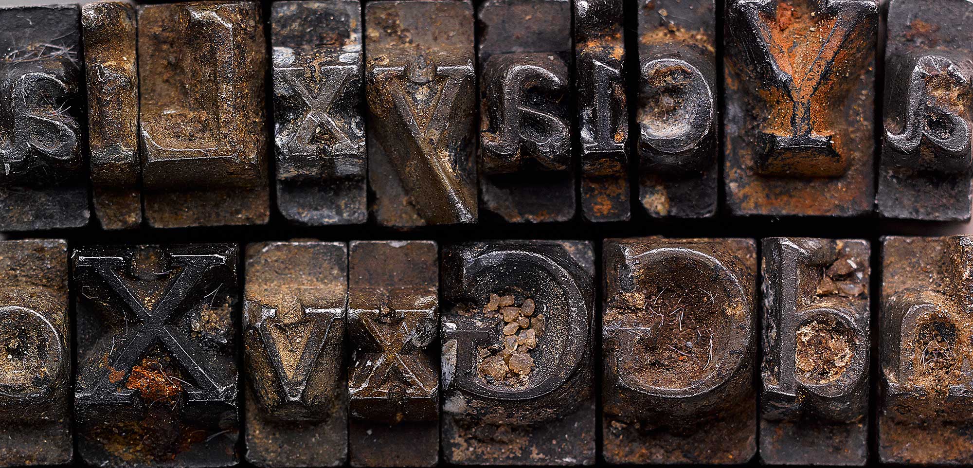
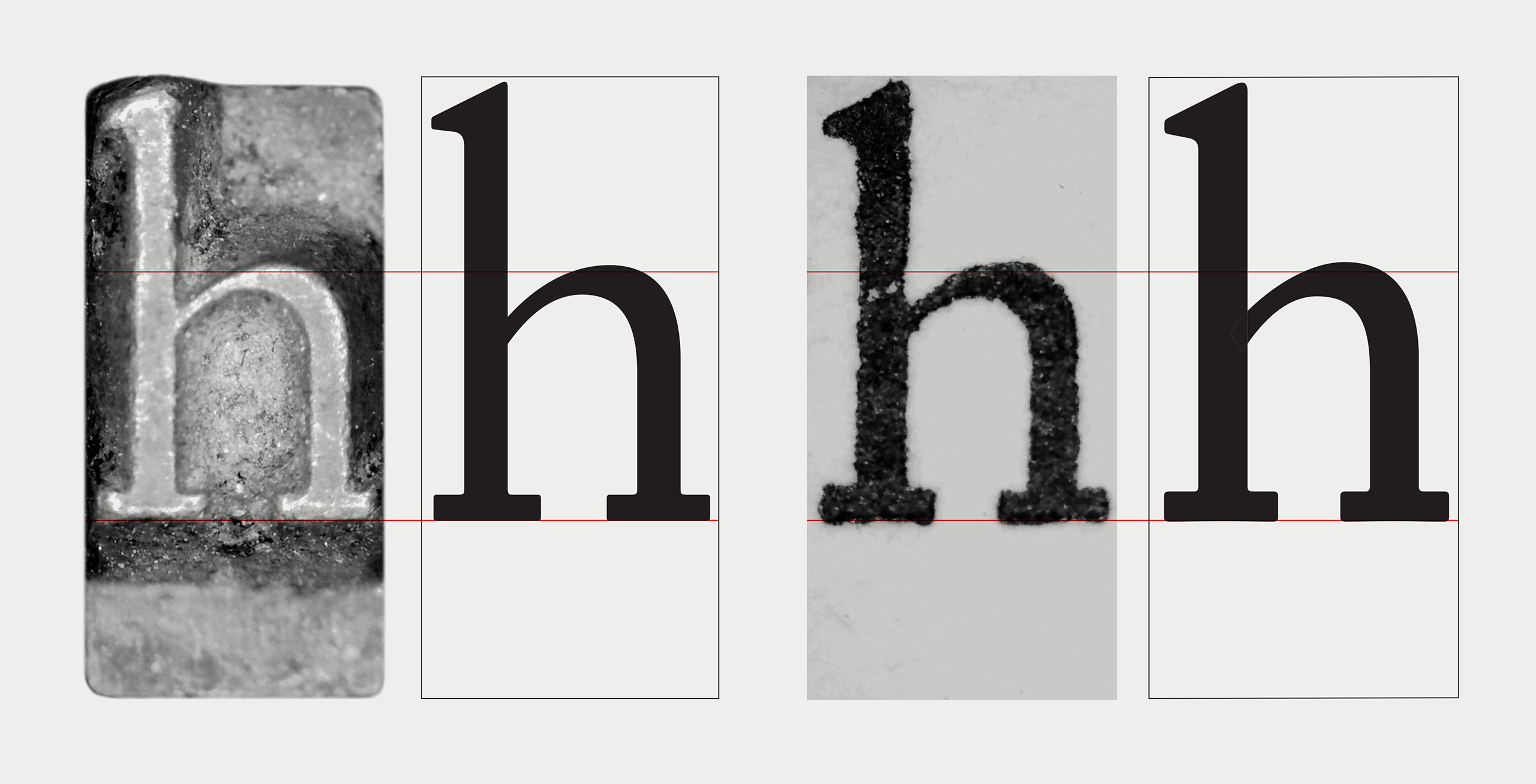
In order to create a definitive reproduction he decided that the original metal sorts, lying on the riverbed, would have to be examined.
In 2016, Green undertook more work to improve the digital font for contemporary usage. This second release of the updated Doves Type contained extended glyph coverage including small caps, together with both lining and tabular figures.
Metrics were also adjusted for 21st century usage. The original Doves Press type, cut for letterpress with its physical constraints and inherent quirks, contained spacing which would appear uncomfortable to modern eyes in web and litho applications.
¶ Doves Type revisited 2022, new Text & Headline fonts:
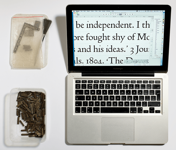
Ever since Green began the project in 2010, he has collected an ever expanding range of Doves Press publications and other materials such as ‘overs’ sheets and proofs, in addition to the metal type he salvaged in 2014. Each new example highlighted another aspect of the typeface he hadn’t noticed or considered before. He eventually decided the type needed to be redrawn entirely.
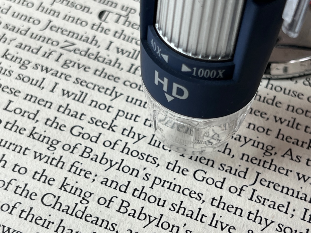
Using a digital microscope camera enabled Robert to capture more detail than he’d previously been able to achieve and the technology was fundamental to revealing tiny individual characteristics that informed his revised letterforms.
The metal sorts were also used as sources for outlines and were drawn separately, then cross-referenced with drawings derived from the printed type. Before long, largely due to his involvement in the Thames Tideway project, Green realised that not one, but two versions of the revised Doves Type were taking shape; a Text version similar to previous iterations of the Doves Type, and a sharper Headline variant commissioned by Tideway, adapted specifically for use in challenging fabrication processes across multiple surfaces such as brick, granite, brass, wrought iron, and steel.
¶ Doves Text & Doves Headline, the key differences:
Both versions of the new Doves Type (v4) have been released as Doves Text & Doves Headline. The fonts differ slightly in weight and rendering, and each has a specific purpose.
The heavier and softer Doves Text was designed for setting copy at sizes below 20 pt. It is similar to previous iterations of the Doves Type: stem and stroke weights remain the same, comparable to a book cut, but the updated version is intended to be an improvement for print and onscreen applications. It’s still an attempt to recreate the soft ink spread of letterpress, but some of the irregularities present in the last commercial version (v3) have been eliminated.
Doves Headline was designed for larger applications such as titles, headings, and sub-headings. As mentioned above it evolved due to practical considerations arising from work on the Thames Tideway project. It is lighter and sharper that the Text font, recommended for sizes above 20 pt, for use as an optically adjusted cut of the Doves Type.
Read more about the development of the new Doves Type Text & Headline fonts in Robert Green’s blog article.
¶ Doves Type font licence options:
Click a purchase button below to license the font for personal and commercial use. Buy a licence for desktop, web, app or ePub use and receive a link for immediate download with your transaction receipt/invoice. For any other licensing queries (e.g. enterprise, broadcast or digital ad use) simply email us.
If you’ve previously purchased a licence for an earlier version of Doves Type you’ll be eligible for a free upgrade to the new Text font only, simply click here to enter your purchase details and receive a new download link.
BUYING BOTH TEXT & HEADLINE FONTS? ENTER THE CODE DTFAM25 AT CHECKOUT TO GET 25% OFF YOUR PURCHASE WHEN LICENSING BOTH VERSIONS.
VAT tax is only charged within the EU; orders placed outside the EU (e.g. USA) will automatically have VAT removed from their final transaction price. Buyers have the choice of paying with their own credit/debit card or via PayPal.

Desktop Licence
A licence to install the font on a Mac or Windows computer/laptop etc for use with desktop software programs and printers. One time fee based on number of users.
Text font:
Headline font:
Webfont Licence
A licence to embed the web formatted versions of the font on your website using the CSS @font-face rule. One time licence based on your site’s average monthly pageviews.
Text font:
Headline font:
App Licence
A licence to embed the font into a digital app developed for mobile or tablet use. App licences are multi platform (e.g. iOS, Android, Windows Phone) and priced per title.
Text font:
Headline font:
ePub Licence
A licence to embed the font into commercial PDFs or electronic publications such as eBooks, eMagazines or eNewspapers sold to customers or subscribers. Priced per title.