12 data maps that sum up London
- Published
A new collection of data maps of London reveals a city heaving with information.
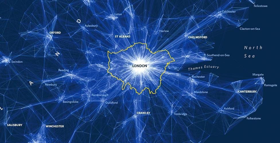
A quick quiz question for you. How many football pitches could fit inside the Greater London boundary? Well, 220,000 of them would fill the space between Cockfosters and Croydon, Heathrow and Hornchurch.
That statistic is just one of thousands of facts and figures contained in a new book about London, which according to its creators is the most data-heavy capital of the world.
Geographer Dr James Cheshire and visual designer Oliver Uberti say their book - London: The Information Capital - is not an atlas, but instead a series of data portraits.
Scroll down to take a look at a few of their colourful and imaginative maps and infographics.
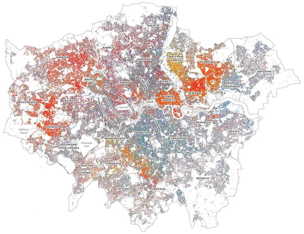
Ethnicity
From greys and blues to autumnal shades of yellow and red, this colourful dotted map of Greater London shows 2011 Census information - which found that fewer than 45% of Londoners consider themselves "White British".
To put the map together, the authors counted the number of people per self-reported ethnic group across 25,270 small areas - each of which is home to about 250 people.
They then scattered coloured dots within each of these areas for every 20 people or so of the same ethnicity. Places with lots of different coloured dots are therefore more ethnically diverse.
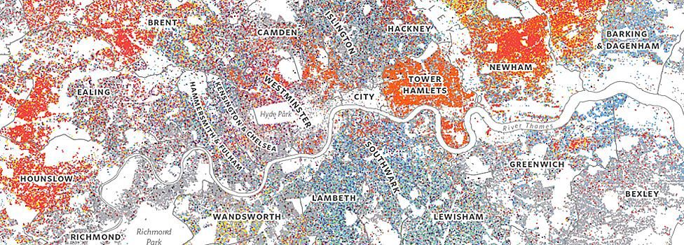
The close up image below spans from west to east. It shows strong Asian representation both left and right.
In Hounslow in the west, and Newham in the east, people of Indian origin dominate - while in Tower Hamlets, London's traditional East End, it's Bangladeshi ethnicity which is strong.

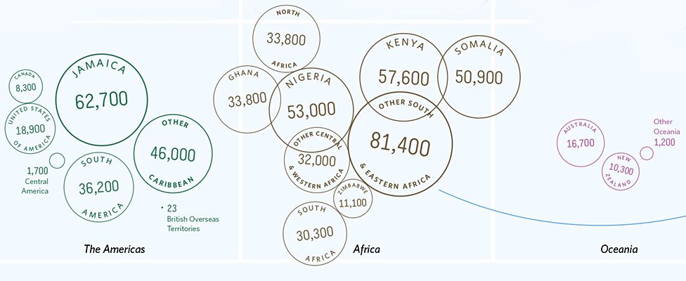
Passports
This infographic relates to the question asked in the 2011 Census, "What passports do you hold?"
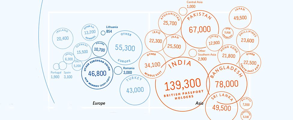
5.8 million Londoners ticked United Kingdom, but of those, many were not born in the UK and had since gained British or dual citizenship.
Proportionately-sized circles of countries are stamped here, passport-style.
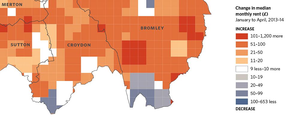
Renting
London has become a city of renters, says the book. This map of Greater London shows the change in median rents from January to April 2013-14.
The 2012 Olympics increased prices around Stratford station on the Central Line as people clamoured to be close to the action.
But the white, grey and blue colours in the diagram in that part of east London hint that property supply is now closer to demand, and as a result, rents have fallen.
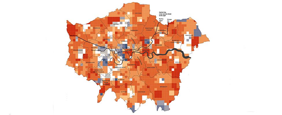
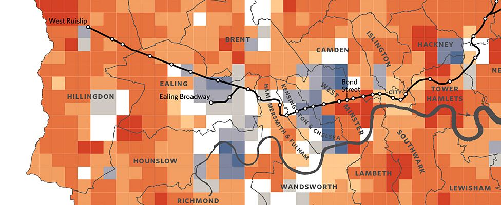
Out to the west, as shown above, the Central Line travels from suburban West Ruislip, through Greenford and Perivale, into the pricier parts of town.
Rents may have dropped in Ealing, Kensington and Chelsea - but they are still among the most expensive parts of the UK in which to live.
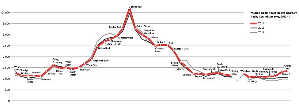
The graph below takes a journey along the Central Line showing the average monthly rent for two bedroom flats at each stop.
£1200 will get you a bolthole in Northolt, but a pied-a-terre off Bond Street in the West End will set you back at least £4000.
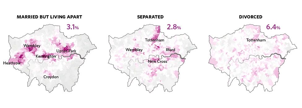
Relationship status
Singletons at 20. Married or cohabiting by 30. That is the trend colourfully depicted here.
Again, using figures from the 2011 Census, the book reveals how many people marry and then migrate from inner to outer London.
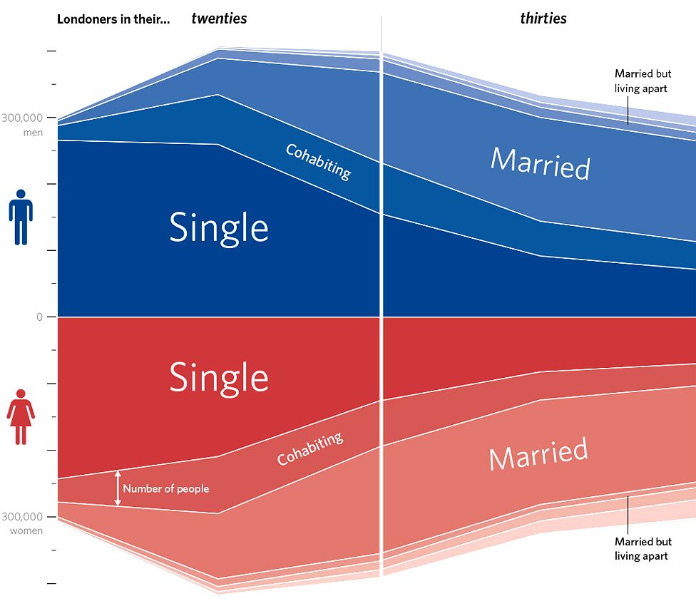
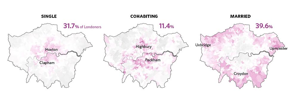
With darker purple showing those areas with above average concentrations of each relationship status, it is easy to see the cycle of life in London.
The young and single prefer to live close to town. Trendy areas - like Hoxton and Clapham - are popular.
Once people have started living with a partner, many prefer to move a little further away from the centre of the city - a few more stops on the Tube or bus.
Outer London is a purple ring of wedded bliss.
Should such bliss break down irretrievably - the maps below (centre and right) reveal where higher numbers of separated and divorced people live.
The divorce map has a far more even spread of colour - especially when compared with the "married but living apart" map on the left, which shows strong concentrations in four distinct areas north of the Thames.
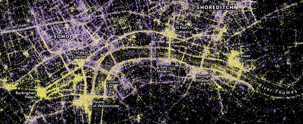
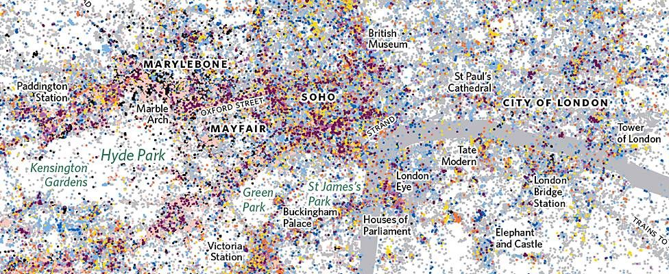
Sites of interest
A snap of the soldiers in front of Buckingham Palace by day, or the bright lights of Piccadilly Circus by night?
This shows how users of the photo-sharing site Flickr captured views of the city's attractions.
The original image, larger than this excerpt, has dots for more than 1.5 million pictures taken by 45,000 people.
The dots measure luminance. Green ones show where photos were snapped outside in daylight. Purple ones were taken indoors or at night.
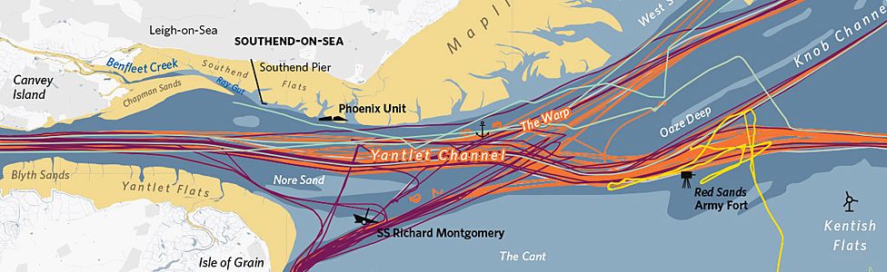
The Thames
The Thames - river and estuary - sees a concentrated convergence of nautical traffic, as these excerpts of a larger map show.
The Port of London Authority is responsible for the safe passage of vessels along a 95-mile stretch of water.
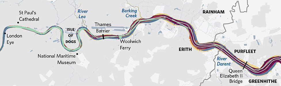
The full-size graphic shows 24 hours of movements - on 12 April 2014 - with the tracks of 334 ships, registered in 26 different countries.
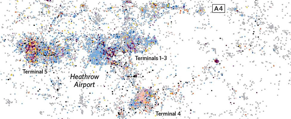
Lost property
This is a digital interpretation of physical traces left behind by visitors to Heathrow Airport.
In 2013, the lost property office there logged 34,000 items - from luggage and laptops, to musical instruments and stuffed animals.
Each icon above and below equates to 10 items.
It means that the whole image, with line after line, is rather mesmerising.
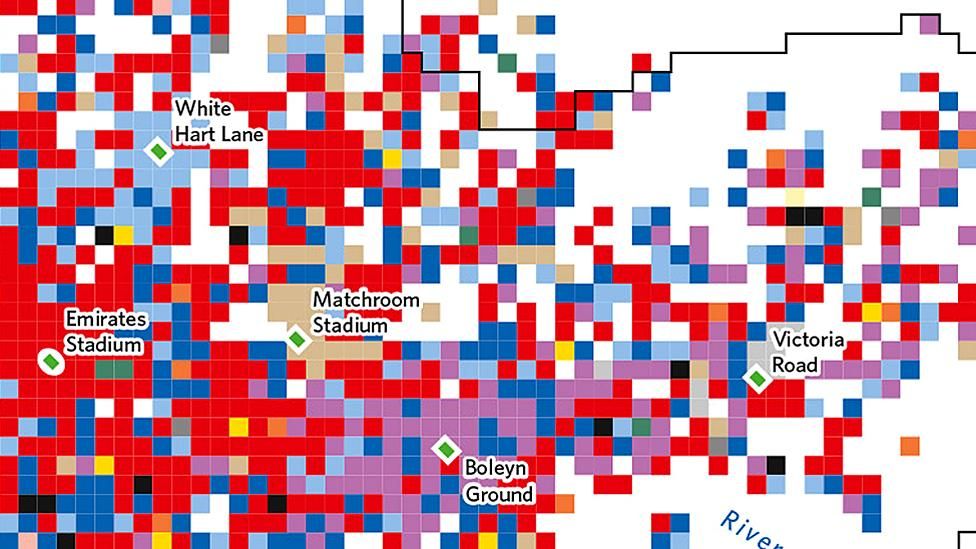
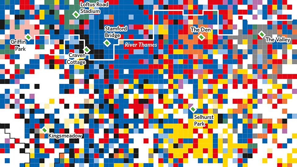
Football clubs by popularity on Twitter
Up the blues! Up the reds! Up the yellows, blacks and greens!
This diagram depicts London's football clubs by popularity on Twitter for the 2013/14 season.
Each square represents 500m x 500m - and its colour indicates the football club with the most-tweeted hashtag in that area.
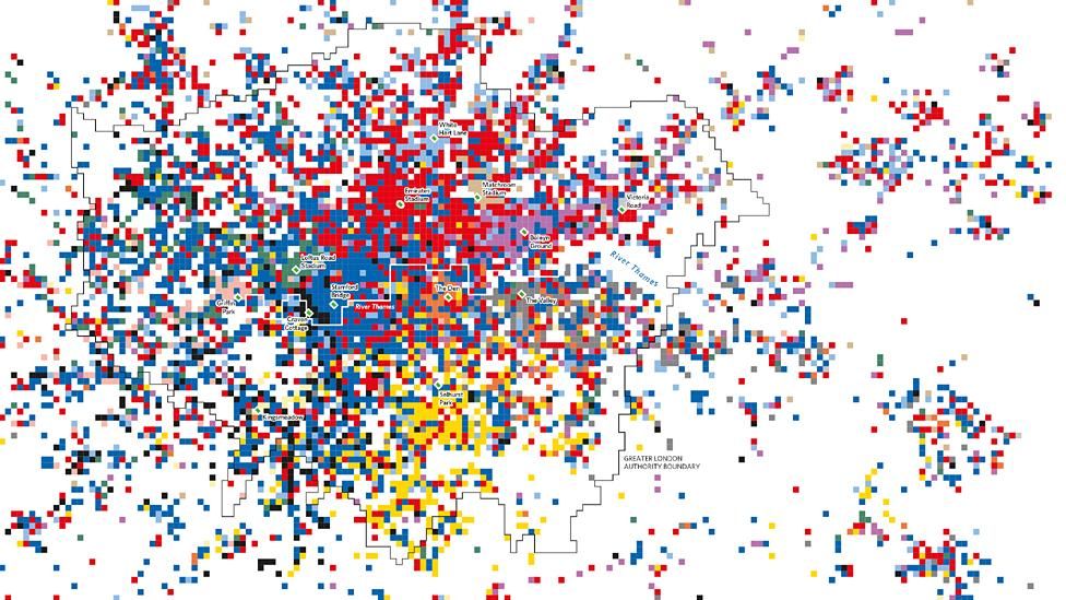
Predictably, for most of the clubs, the immediate area around their home grounds are solid in their allegiance - although the tweets might not necessarily have featured endorsements of team performance.
North London is dominated by Arsenal, with tweets from rivals Spurs in light blue - and West Ham in purple - struggling to be seen.
Chelsea blue rules in south-west London - with nearby neighbours Fulham squashed into a sliver of black along the banks of the Thames, close to their ground at Craven Cottage.
That season, Chelsea finished ahead of Arsenal in both the Premier League and the Twittersphere.
Tweets by home country
These images are close-up sections of a much bigger map showing 9.4 million tweets across Greater London.
The splattered dots show not only where the tweets were sent - but also the home country of each Twitter account holder.
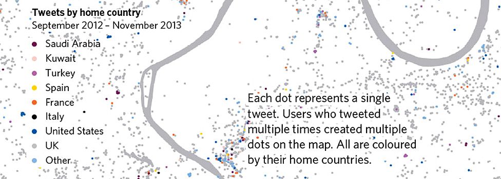
Outside central London, Wembley and Heathrow have high concentrations of tweets - because of the sport and music events at Wembley Stadium...

...and the number of people flying into and out of London's biggest airport.
Busiest rail stations
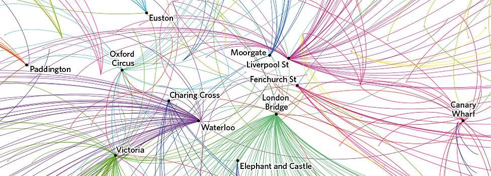
This section of a larger graphic uses data from Oyster travel cards - and a bit of artistic licence.
It shows the most-exited rail stations between 7-10am in July and August 2012.
The sweeping coloured arcs arrive at the named stations from other Underground, Overground and National Rail stations.
Commuters head to Oxford Circus from the north, east, south and west - but the arcs into each mainline rail hub arrive mostly from one general direction.
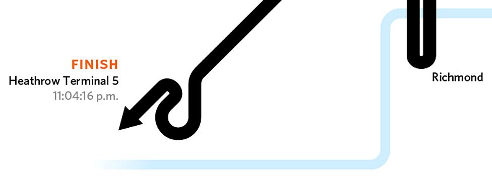
The Tube Challenge
This map shows a record-breaking way of visiting all 270 tube stations in a single day.
But this winning route from 2009 is already out of date.
Two more successful challenges have been made since then, but the Tube Challengers are understandably secretive about their routes.
But one thing is certain - you will need to get up early to stand any chance of success,
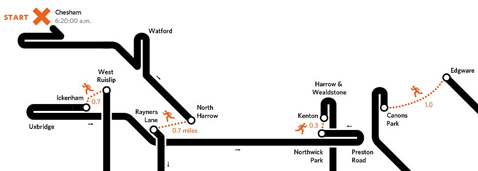
There are several places on the route where you would need to run for it - it being quicker to head on foot between stations rather than take a more circuitous journey by rail.
It would also be a late finish after a long day. Maybe time to fly off on holiday for a rest?
All images are subject to copyright - London: The Information Capital by James Cheshire and Oliver Uberti
Subscribe to the BBC News Magazine's email newsletter to get articles sent to your inbox.