The story begins in 2006 with a trip down Route 66. Day in, day out, I looked at U.S. traffic signs that were either set in the old, somewhat clumsy “FHWA font series” or the new Clearview HWY typeface. Approaching the signs, I would often test myself: which typeface works best from a distance, and which of its features or details might be responsible for its performance. I had so many more questions than answers. Surely every professional type designer has at least an inkling of how a signage typeface should look: Probably it sports a rather clean sans serif design, open counters and a rather large x-height. But which x-height works best, and why? What is the optimal stroke width? A monocular or binocular g? Should the design be somewhat condensed to permit more information on a sign, or rather should it be relatively wide so that individual letters are more easily differentiated?
I was unable to fully answer those questions, but felt that I must find the answers, no matter what the cost. Back in Europe I began studying the typefaces on road signs just about everywhere the Latin script is used. But looking at photos or signage specifications doesn’t reveal much about the actual performance of those typefaces. So I set off, driving thousands of miles across Europe to explore the legibility of these signs and typefaces, first hand. Once I even ended up in a holding cell at the border crossing to Norway, because the customs officers just wouldn’t accept that someone would drive all over Europe simply to take photographs of traffic signs. (See my FLickr sets World of Traffic Signs and Type on Traffic Signs.)

I was surprised by the sheer variety of type styles I discovered on my journey. Even though all road signage systems are intended to be as legible as possible, there appears to be no consensus on how to achieve this in terms of type treatment. Some road signs used grid-based typefaces, some were extremely wide geometric typefaces with the simpler forms of a and g, some very thin, and some very heavy. These days, with digital sign production, we see more and more print typefaces (like Helvetica) and even system typefaces (like Arial) on signs. The old geometric and grid-based typefaces were mostly a product of the drawing and sign-production methods of the time. Today we can choose from hundreds of very legible, high quality print typefaces; however, during my own research I remained skeptical that simply plastering our best print typefaces on road signs would be the best way to go.
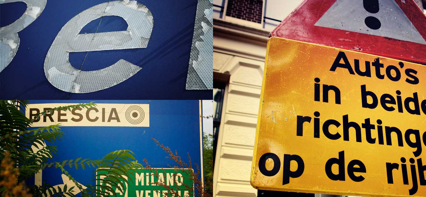
A typeface on a sign that is read from 300 yards has different requirements than a typeface read in a magazine, from your armchair. And even if the typefaces are designed specifically for signage, they are often a local solution that just doesn’t work everywhere. For example, the Transport typeface used in the U.K. is a very good and legible design, but it is designed for English words and names and is far too wide for the generally longer names of German cities. Another example is the Clearview typeface with its extreme x-height, which works on American road signs, but not so well for languages using numerous diacritical marks. So in the end, for every typeface I checked and tested, I discovered both advantages and disadvantages. There was not a single typeface that I could recommend for signage in every situation.
Once I even ended up in a holding cell at the border crossing to Norway, because the customs officers just wouldn’t accept that someone would drive all over Europe simply to take photographs of traffic signs.
So I determined there was still room for a new signage typeface with a broad range of potential uses, and I hoped that I could design one that would even be more legible than the common existing ones. From the outset it was very important to me that I did not base my work on any of the existing typefaces typically used for signage. I wanted to build my typeface from the ground up, challenging every design principle of signage typefaces. But this also led me to my first major design problem. A signage typeface is all about the moment — when you come close enough to the sign that it just becomes readable. And it’s here where you can actually make a difference. When you attempt to improve the recognizability and distinguishability of these blurry letters just a fraction, the typeface becomes easier to read from a greater distance, thus you have already created a more successful signage typeface. But how should I create a typeface for a reading situation that I can’t actually replicate? A screen typeface is judged on screen, a print typeface is judged from print-outs, but testing every little design detail of a signage typeface by always mounting different designs on actual signs would be, to say the least, rather impractical.
A typeface on a sign that is read from 300 yards has different requirements than a typeface read in a magazine, from your armchair.
That’s when I came up with the idea of the Legibility Test Tool, an OSX application I built that offers real-time simulations of different viewing conditions (distance, fog, halation, and positive/negative contrast) during the design stage. While I was working in my font editor on the design of individual letters, the tool simulated views of test words with the letters I was working on. With this tool I could completely remove the guesswork, therefore optimizing my design for even the very worst reading conditions. Often the simulations surprised me. Sometimes I was tempted to design my typeface in the way I was accustomed to from the print world, but the tool clearly demonstrated that the reading conditions of road signs require a unique design solution for maximum legibility within this context.
The design process itself was also very different to that of designing a typeface for print. Usually a type designer first sketches out the outlines of certain letters. But naturally, this focuses on the final design and its stylistic details. However, these very details will be the first to disappear when the text is read from a distance. What matters here is the skeleton of the letterforms. So in the beginning I worked with nothing but single-line letter skeletons and no character outlines. This allowed me to apply different stroke widths to those skeletons, thus testing the crucial correlation between the letter skeletons and the applied stroke widths. I also experimented setting the stroke width of my own letterforms to match those of existing typefaces. With this procedure I could directly compare the performance under difficult viewing conditions, and could optimize my design for maximum legibility — arriving at solutions superior to those of existing signage typefaces. A typical result of this working method are the slightly exaggerated details like the wider crossbars of characters such as f and t. Making them rather short in print typefaces permits tight and even spacing within words, but it also makes letters such as l, t, f, and sometimes even i, harder to distinguish, especially when the text is to be read under difficult viewing conditions. So I always tried to create a rather generic letter skeleton that was familiar and easy to recognize; but I also attempted to stress the individuality of each letter to increase letter differentiation, especially for pairs of similar letters.

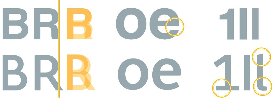
Another crucial feature is the stroke width. When I compare existing typefaces in my Legibility Test Tool, all the typical stylistic differences quickly disappear. But what remains ,and has the most important impact on the legibility, is the letter’s skeleton, the stroke width, and the interplay of these two elements. Sometimes signage typefaces are extremely bold — the rationale being that a bolder stroke can be read from a greater distance. However, an increase in stroke width comes at the cost of smaller counters and therefore reduces legibility. This problem has become even more problematic in the last few decades, with the increasing use of more and stronger retro-reflective sheeting for road signs and back-lit signs in airports, subway stations and so on.

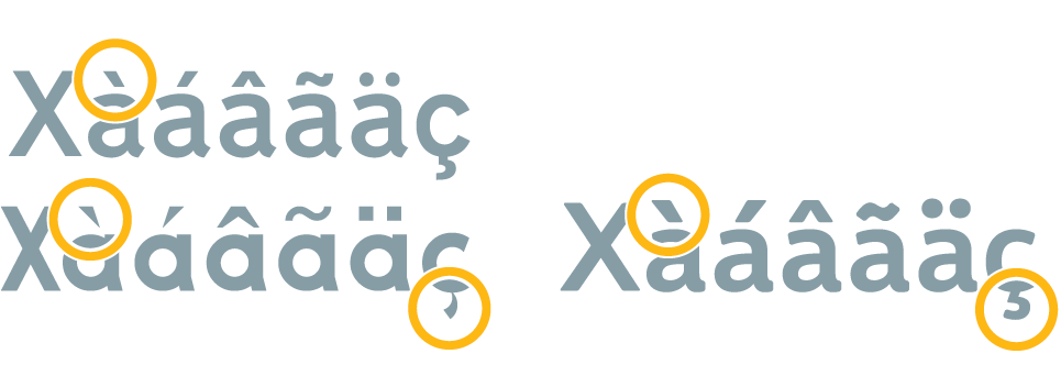
Therefore, I think that the best solution is to define the stroke width and the x-height of the boldest style, based on crucial letters such as a, e, and s, which have up to three strokes within the x-height. When the strokes of these letters are still clearly visible — even under the halation effect of retro-reflective or back-lit signs — then the typeface will perform well for signage. Diacritical marks are also an important part of many languages using the Latin script. Again, what might be desirable in print, might not work for signage. On signs the diacritical marks must be unmistakable in their design and prominent in their size, because such separated letter parts will be the first to become illegible or even invisible when viewed from a distance.
Figures are usually designed to blend or harmonize with letters. But the figures of Wayfinding Sans are optimized for the requirements of signage use: maximum distinguishability and lining tabular design, though Oldstyle and proportional figures are also available via OpenType features. Entering and positioning arrows with text in a signage layout can be a time-consuming task. But the arrows of Wayfinding Sans can easily be typed along with the text, simply by activating a Stylistic Set and typing the appropriate code. These codes follow a simple naming scheme based on the cardinal directions: “hyphen hyphen n” will create an arrow pointing up (“North”); add an “e” for East and the arrow will point North-East.
When presenting my work in progress at conferences, I was often asked about scientific proofs for the legibility of my typeface. Personally, I didn’t feel that I needed such proof. I had based my work on a solid theoretical framework, and with my Legibility Test Tool I could simulate the very worst viewing conditions possible. If my typeface performed well in these extreme simulations, then it would also work well for any typical signage use. But as it happens, an independent empirical legibility study was recently conducted at the University of Applied Sciences “htw” in Berlin.
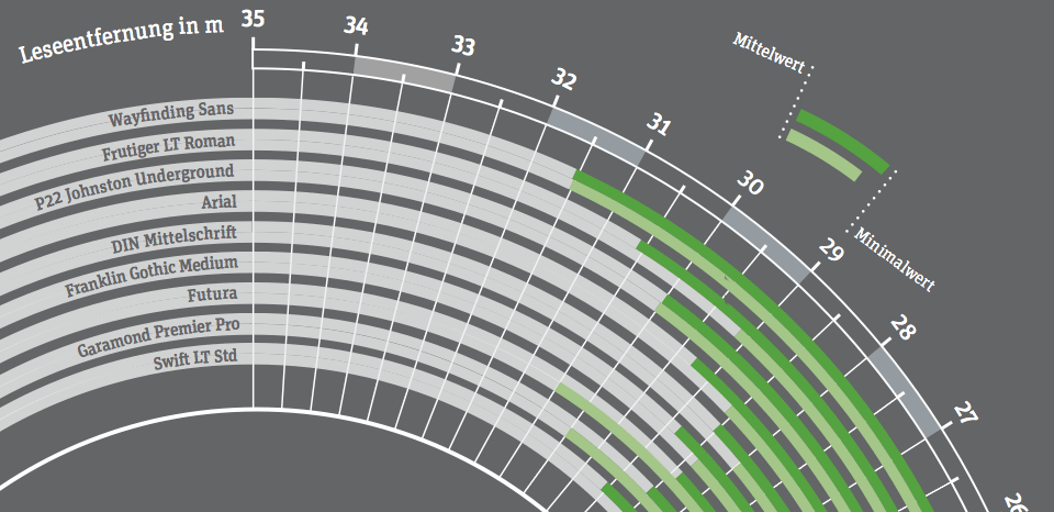
The study tested different typefaces in the context of signage use. I was asked to provide a style of Wayfinding Sans Pro. I shouldn’t have been surprised about the results, but I was certainly happy about them: Wayfinding Sans Pro (bold condensed) was the winner in all conducted tests. It could be read from a greater distance than any of the other styles of the tested typefaces — among them typical signage typefaces like Frutiger, DIN 1451, Johnston Underground, and Futura.
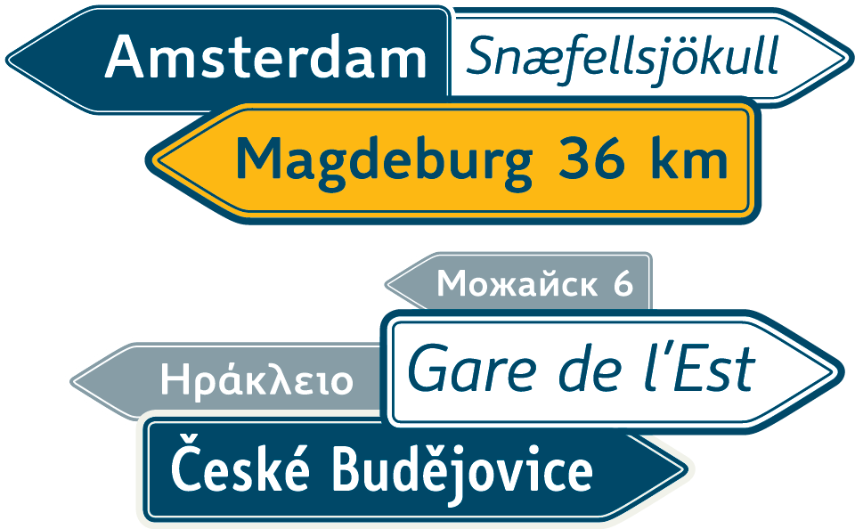
In 2009, I wrote about the progress of my work under the title “The Ultimate Signage Typeface.” I was not suggesting that I had created the ultimate wayfinding typeface; rather, I was attempting to describe the process in creating one. The article received a lot of attention and commentary — I knew I was onto something, so worked even harder toward the goal of creating a typeface that would be worthy of such a title. We have now begun work on additional pictogram fonts comprising hundreds of common wayfinding symbols — the perfect accompaniment to Wayfinding Sans Pro. To take a closer look at the typefaces, check out the PDF type specimen. Wayfinding Sans Pro has just been released and is available in 20 styles at fonts.info and MyFonts.■
Ralf Herrmann studied graphic design at the Bauhaus University Weimar. He is the author of several typography books and founder of the type foundry fonts.info & the German typography community Typografie.info. Since 2009 he is the editor of the German typography magazine TypoJournal. Currently Ralf Herrmann is doing his PhD at the University of Applied Arts in Vienna. In his dissertation he will research the implications of cognitive map research applied to the design of maps and wayfinding systems. Ralf also teaches typography for the MSc course Traffic & Transport Information Design organized jointly by the International Institute for Information Design (IIID) and the University of Applied Sciences FH St. Poelten, Austria, under the auspices of UNESCO.