Last month we looked at an example of an old mapping style being applied to modern data. This time it's the other way round. James Cheshire, of Spatial Analysis, has taken historical records of shipping routes between 1750 and 1800 and plotted them using modern mapping tools.
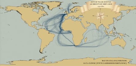
The first map, above, shows journeys made by British ships. Cross-Atlantic shipping lanes were among the busiest, but the number of vessels traveling to what was than called the East Indies - now India and South-East Asia - also stands out when compared to Dutch and Spanish records (see below).
If you look carefully you can also make out Captain Cook's voyages, including his two global circumnavigations.

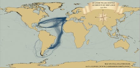
This second map shows the same data for Dutch boats. The routes are closely matched to the British ones, although the number of journeys is noticeably smaller.
You can also see the scattering of journeys made by Dutch ships to Svalbard, off the North coast of the Norwegian mainland.

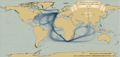
The third map shows Spanish shipping routes, and immediately stands out from the other two. Spanish captains crossed the Atlantic further south than their British and Dutch counterparts, and a large number of journeys rounded Cape Horn before continuing up the West Coast of South America.
The data used to produce these maps was digitised by the Climatological Databse for the World's Oceans and is available for public download here.
If these visualisations have piqued your interest, Ben Schmidt, of Sapping Attention has used the same data to create two animations of the journeys over time.
In the video below, Ben has taken data for all three nations' vessels between 1750 and 1850 and compressed them into one twelve month span to show seasonal patterns. Every journey has been visualised, with ships colour-coded by nation.
Who made these graphics? James Cheshire and Ben Schmidt respectively
Where can I find them? Spatial Analysis and Sapping Attention
NEW! Buy our book
Facts are Sacred: the power of data (on Kindle)
More open data
Data journalism and data visualisations from the Guardian
World government data
Search the world's government data with our gateway
Development and aid data
Search the world's global development data with our gateway
Can you do something with this data?
Flickr Please post your visualisations and mash-ups on our Flickr group
Contact us at data@guardian.co.uk

Comments (…)
Sign in or create your Guardian account to join the discussion