
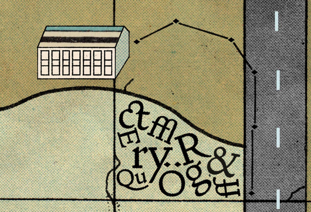
The history of London can be found in pieces on its riverbed. The old pipes and fossilised horse bones wash up on the shore, and with them come the lead letters that printed that history in the newspapers.
The letters ended up there mostly out of laziness, building up piece by piece over the years that Fleet Street served as the epicentre of British journalism. A typesetter’s job was time-consuming: A page of newspaper was laid out one character at a time, the pieces were put back in their boxes the same way. When the typesetters crossed Blackfriars Bridge on their way home from work they’d toss a pocketful of type over the side rather than bother.
They’re still there. There are thousands of letters slowly rearranging themselves over the years and moods of the mud, like alphabet soup.
Newspaper type was common.
The Doves Type was not.
In 1900, 16 years before the Doves Type sank into the mud of the Thames, two friends opened a private printing press. Fifty-nine-year-old Thomas James Cobden-Sanderson and 48-year-old Emery Walker named it after their local riverside pub in Hammersmith, where they lived doors apart. The pub is still there. The printing press is not.
It was never supposed to make any money: The press was purely an artistic endeavour to reprint great works of literature — Shakespeare, Tennyson, Milton, that kind of thing — and was kept afloat by a subscriber system, like Patreon or Unbound. It produced books that were a polar opposite to the over-decorative medieval revivalist stuff that was popular at the time: off-white covers, plain pages, crystal-clear text. For their typeface, they took their design cues from William Morris, who had designed his famous Golden Type the year before, itself a flipside to the overly decorative Victorian era. Morris looked back 400 years to 15th-century Venice and adapted their designs, emphasising their unruly features while Doves calmed them. The Doves Press was rebellious and radical in its simplicity — severe and austere and pared down.
The two men came at the press from different angles: Walker provided the technical know-how, oversaw the metal type being cut by hand, and — trusting the seven employees they had amassed — dropped in intermittently. Cobden-Sanderson made it his life: He stayed up late into the night, obsessively checking pages for errors. In 1906, six years after their partnership began, Cobden-Sanderson asked to dissolve it. He wanted to go it alone.
From there the story becomes twisted and sad, but mostly just convoluted and dry. Letters flew back and forth, the two friends threatened to drag each other through court but never did. At the centre of their feud was the Doves Type, by this point considered the most beautiful typeface in existence. Walker wasn’t leaving it behind, and Cobden-Sanderson couldn’t continue the press without it: The type was the thing that defined it.
Eventually an agreement was drawn up by a mutual friend, tired of watching the fight, in which Cobden-Sanderson, the older of the two, kept the type until his death. It would go to Walker, postmortem.
They lived so close that while they were falling out, Walker was still working downstairs from where Cobden-Sanderson was sleeping — or more likely lying awake, staring at the ceiling, plotting to get rid of the type forever.

Robert Green is 40ish and works as a graphic designer in a sparse, clean studio on the top floor of an old building on Kingsland Road in east London. It has a wooden lift with a wooden door and a metal grate; every time you use it, you pray for life to find a way.
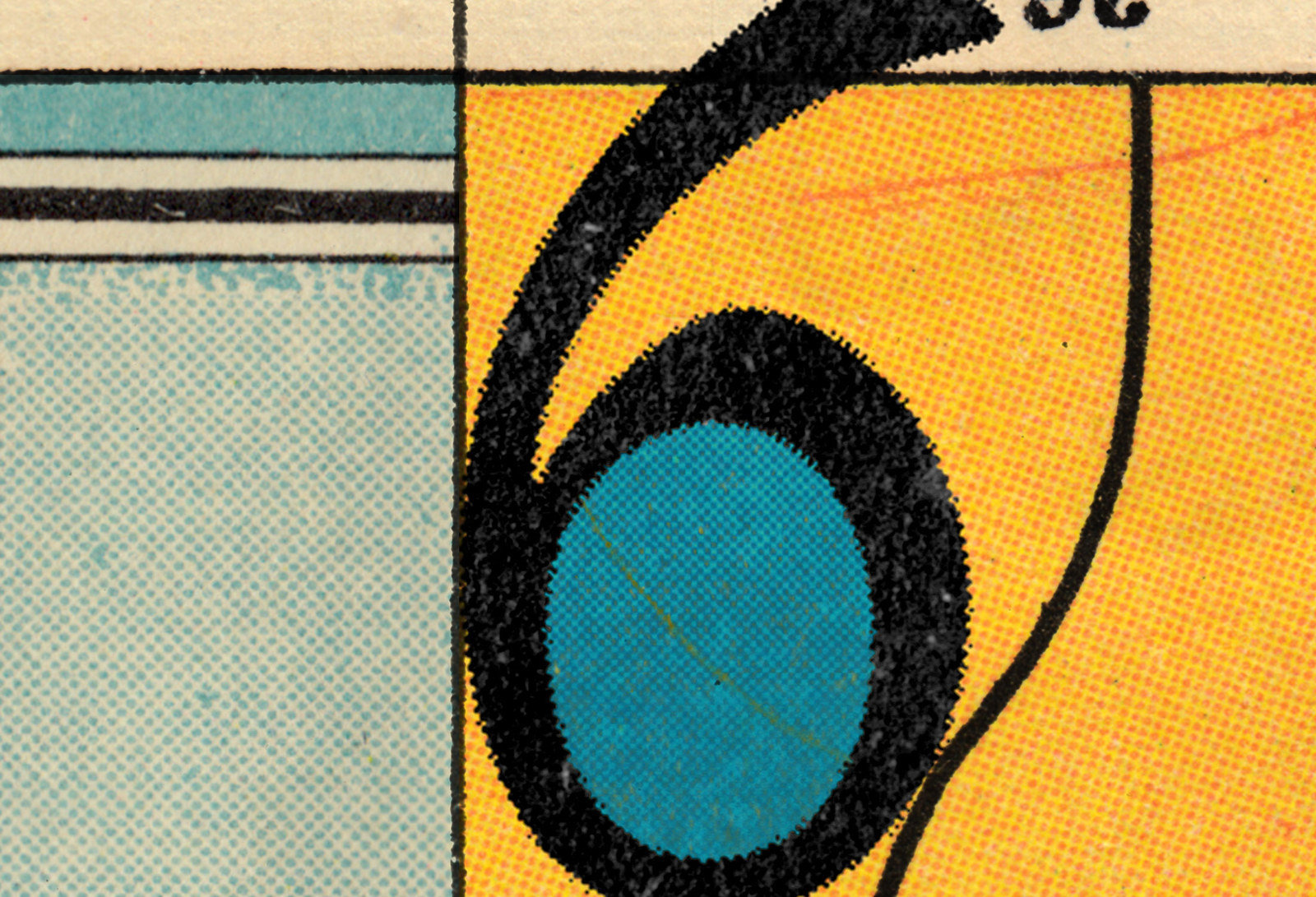
He greets me at the top where he’s working on a digitised version of the Doves Type, a "6" blown-up huge on his computer.
“It’s driving me mental,” he says. He repeats the phrase a lot over the two hours of my visit, running a hand over his shaved head, blinking at vectors on a screen. He obsesses over details so tiny they are, to the layman, as small as atoms. It’s his job.
“People think that type just rains down from heaven unbidden, it just comes through the internet,” he says, and then, his face incredulous: “What do you mean you design type? Somebody draws that?”
The author of a typeface is hidden, I suggest. I have no idea who made Helvetica.
“Well, they are unless it’s Gill Sans or Jenson or Baskerville,” he says, listing a few eponymous typefaces. “The author is hidden and they’re not.”
All the typefaces in your drop-down font menu were designed by someone — maybe last year, maybe a hundred years ago or more — but someone drew it by hand a thousand times over. Like everything else, typefaces fall in and out of fashion; the foundries that cast them would exist then disappear and the metal would be melted down and reused. Typographers revived them from printed pages in the 20th century.
Green turns to the "6" on his screen and shows me how it’s done, and how it can drive a man insane. He pulls an anchor slightly to the right and the curve on the belly of 6 bulges, making the whole thing look off-kilter, stretched, weirdly pregnant. He shows me pages of drawings — blown-up, shrunk-down, hand-drawn letters. Thousands of them. Each of them wrong and right in their own microscopic ways. Or so he tells me.
Green found Doves when he was looking around for a typeface to use in his own private press. He saw it in an old book but no matter how deep he dug into the internet, he couldn’t find a digitised version anywhere.
He didn’t know that it was at the bottom of the Thames.
“I just thought it was beautiful,” he said.
It had escaped the typeface resurrectionists. So Green became one.
In 1917, a note appeared in The Times from Cobden-Sanderson announcing the end of the Doves Press, but it was written in such florid language that no one could tell if he was being metaphorical when he said he “bequeathed” the type to the Thames.
He wasn’t. He had literally chucked it into the river.
In the final months of 1916, Cobden-Sanderson threw the punches and the matrices — the templates needed to cast type — into the water beneath Hammersmith Bridge, and followed them with every piece of Doves Type that existed.
He scattered it in tiny pieces from his pocket like tired typesetters on Blackfriars Bridge, he threw it in blocks from the foundry, and he dropped it arranged into the pages they had printed, wrapped in paper and tied with string. He did it in the night, in the dark, when no one could see him.
“I think it’s as much about quality as about any sort of underlying philosophy about industrialisation causing misery,” says Green. He’s spent a long time trying to unfurl Cobden-Sanderson’s reasoning – people have put it down to him being a Luddite, in fear of the death of the hand-pulled printing press. But that's not what motivated Cobden-Sanderson. He was worried Walker would sell it, that anyone could make a Doves Press knock-off, that it might be used for things other than great works of literature. That it might be used for advertising.
Plus, he’d had been reading Leviticus late at night, while checking for errors in their five-volume edition of the Bible. That kind of thing can get to a guy, spiritually.
“As a 70-year-old man, to walk along every night in the middle of winter with pounds and pounds of type, and risk his reputation, risk arrest, risk pneumonia or at least putting his back out — this stuff weighs a lot and he’s a tiny, frail man — there’s an element of his own sacrifice to this,” says Green. He ultimately sacrificed a ton of lead.
Five years later, Cobden-Sanderson was dead at the age of 81. He had been dead for just 12 days when Walker — who was by (most) accounts very gentle and mild-mannered but had been driven to madness by his former friend’s actions — served his grieving widow with a writ for £500, the cost of the production of the type that her husband had destroyed.
When she died four years later her ashes were placed alongside her husband’s on a wall at the bottom of their garden — on the other side was the Thames.
The following year, the river swelled and swallowed the ashes, sweeping them under Hammersmith Bridge, adding them to the type in the mud.

Typographer Tobias Frere-Jones says that to devote your life to type, more than anything else you need to be very, very patient. For him, this career was the rare intersection of two others he couldn’t choose between: writing and painting, equal parts logical and emotional. He says that everyone is affected by type, even if they’re not consciously aware of it. He tells me over email that the shapes and rhythm of a typeface create a personality that can underscore (or undermine) the text it carries. “It’s a lot like what costume designers do in films, dressing the characters in ways that quietly tell us about their personality.”
Making a typeface is about the balance of relationships — move a bit here and you mess up a thing there — and occasionally the stories of their makers are eerily similar. In 2014, the ampersand in Hoefler & Frere-Jones — the foundry most famous for creating Gotham, the bold typeface used on Shepard Fairey’s Barack Obama/Hope campaign — was removed from the sign on the office door, along with Frere-Jones.
Friends fall out in business all the time; bands split and hearts break as regularly as the tide. But is there something in the obsessive designer’s personality that makes it more of a thing? Cobden-Sanderson and Walker, Hoefler and Frere-Jones: These stories echo each other in weird ways, but they’re unusual. Author and printmaker Audrey Niffenegger tells me that while type is very emotional — “like music or math, if you know what you’re looking at, it can be sublime” — its makers aren’t, and it rarely goes wrong like these two cases have.
“That's why these stories are so compelling,” she says. “It's as though the nice neighbour suddenly axe-murdered his wife.”
Two years ago, Green had become so obsessed with resurrecting the drowned Doves Type that he paid ex-Marine divers to go down and find the pieces.
He’d already made his digital version and it had been used in the accompanying book for an Isabella Blow exhibition at Somerset House — you can buy the typeface online for £40. But the problem with reviving a typeface from print is you have to make a lot of arbitrary decisions: Was a nub in the curve of a lowercase "g" supposed to be there, or was that a splodge of ink forced out of its intended course by accident?
Seeing his version in print, Green thought he’d made it too light, too spindly. He wouldn’t be able to sleep until he’d fixed it. “I thought, well, I’ve driven myself nuts over it, if I’m going to spend another six months on it I may as well go and find the metal and see what it really looks like.”
While Cobden-Sanderson had expunged every mention of Walker from his journals, he never hid the whereabouts of the type. There were enough details to work out where he was standing on the bridge at night: a 5-metre radius where he’d be concealed from police, oncoming traffic, and Emery Walker’s window.
“I went down on to the riverbed and within 20 minutes I’d found three pieces of type,” says Green. “It was near where I thought it was, but over a hundred years it had been pushed maybe 20 yards.”
It bolstered his confidence enough to phone ex-Marine divers and explain the situation. They tried and failed to talk him out of it.
Green shows me a four-minute video from the day of the divers. The person holding the camera asks Green why he’s here. He looks nervous as he gives an abbreviated history of the Doves Type to the camera, a reporter from The Times, and another from Radio 4. Watching it in his studio now, Green says he was inwardly freaking out because nothing had happened yet: three hours and nothing, and all these people watching.
“Also we were sinking into the mud,” he says. “The riverbed is like quicksand.”
More footage from the bridge shows passers-by stopping to peer down at the divers rolling backwards off the boat, who, for all they know, might be looking for bodies.
A diver surfaces, shouts something, and Green abandons the camera and runs.
In total, they found 151 pieces.
Right now, Green is working on an italic of the Doves Type. He’s adding Icelandic figures and pieces of punctuation the Doves Press did without. He’s added a further 290 characters to Walker and Cobden-Sanderson’s 100, because you can’t sell a font in 2016 without the @ symbol. He moves some vectors around, zooms into the grid digitally, and then gets his face up close to the screen. “As far as I’m concerned there’s little bits of it that still jar me,” he says, clicking at the edges of the 6 with his mouse.
He won’t tell me how much it costs to send three ex-Marine divers down to the bottom of the Thames to find — in the great scheme of things — needles in haystacks, 16pt lead letters in mud.
He says it’s not as much as I probably think it is.
What’s the ballpark figure on obsession?