Houdini: Maybe The Most Exciting Development In CSS You’ve Never Heard Of

Email Newsletter
Weekly tips on front-end & UX.
Trusted by 200,000+ folks.


 Register!
 Flexible CMS. Headless & API 1st

Have you ever wanted to use a particular CSS feature but didn’t because it wasn’t fully supported in all browsers? Or, worse, it was supported in all browsers, but the support was buggy, inconsistent or even completely incompatible? If this has happened to you — and I’m betting it has — then you should care about Houdini.
Houdini is a new W3C task force whose ultimate goal is to make this problem go away forever. It plans to do that by introducing a new set of APIs that will, for the first time, give developers the power to extend CSS itself, and the tools to hook into the styling and layout process of a browser’s rendering engine.
But what does that mean, specifically? Is it even a good idea? And how will it help us developers build websites now and in the future?
In this article, I’m going to try to answer these questions. But before I do, it’s important to make it clear what the problems are today and why there’s such a need for change. I’ll then talk more specifically about how Houdini will solve these problems and list some of the more exciting features currently in development. Lastly, I’ll offer some concrete things we as web developers can do today to help make Houdini a reality.
What Problems Is Houdini Trying To Solve?
Any time I write an article or build a demo showing off some brand new CSS feature, inevitably someone in the comments or on Twitter will say something like, “This is awesome! Too bad we won’t be able to use it for another 10 years.”
As annoying and unconstructive as comments like this are, I understand the sentiment. Historically, it has taken years for feature proposals to gain widespread adoption. And the reason is that, throughout the history of the web, the only way to get a new feature added to CSS was to go through the standards process.
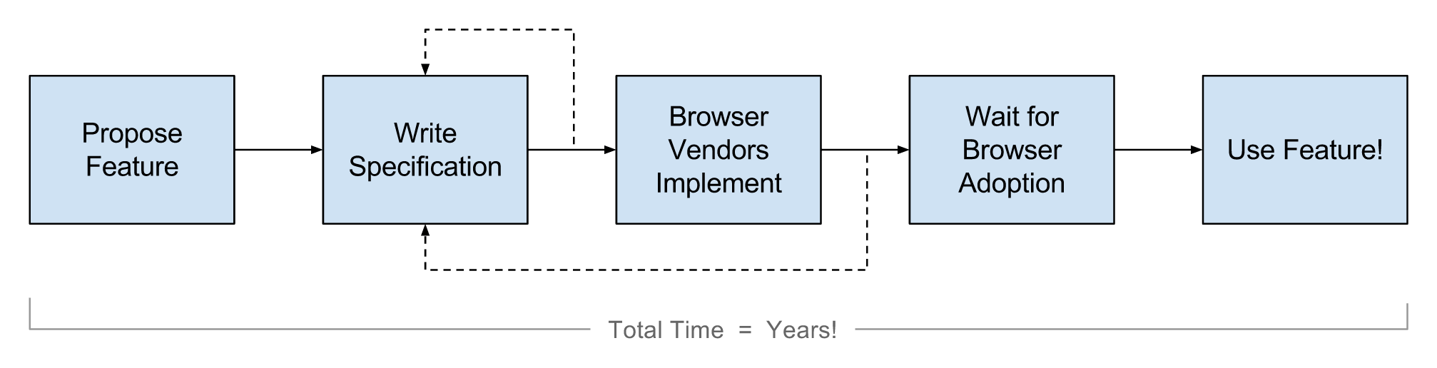
While I have absolutely nothing against the standards process, there’s no denying it can take a long time!
For example, flexbox was first proposed in 2009, and developers still complain that they can’t use it today due to a lack of browser support. Granted, this problem is slowly going away because almost all modern browsers now update automatically; but even with modern browsers, there will always be a lag between the proposal and the general availability of a feature.
Interestingly, this isn’t the case in all areas of the web. Consider how things have been working recently in JavaScript:
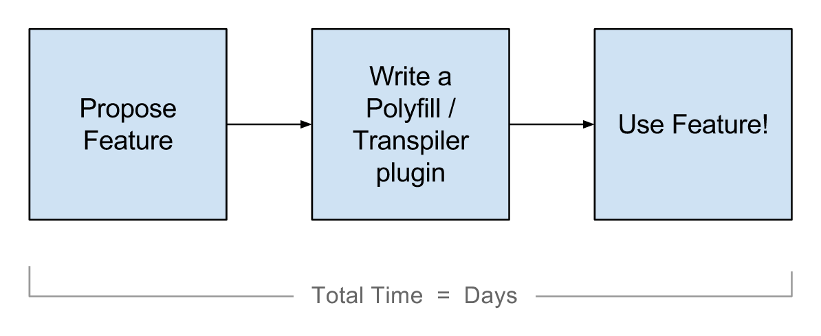
In this scenario, the time between having an idea and getting to use it in production can sometimes be a matter of days. I mean, I’m already using the async/await functions in production, and that feature hasn’t been implemented in even a single browser!
You can also see a huge difference in the general sentiments of these two communities. In the JavaScript community, you read articles in which people complain that things are moving too fast. In CSS, on the other hand, you hear people bemoaning the futility of learning anything new because of how long it will be before they can actually use it.
So, Why Don’t We Just Write More CSS Polyfills?
At first thought, writing more CSS polyfills might seem like the answer. With good polyfills, CSS could move as fast as JavaScript, right?
Sadly, it’s not that simple. Polyfilling CSS is incredibly hard and, in most cases, impossible to do in a way that doesn’t completely destroy performance.
JavaScript is a dynamic language, which means you can use JavaScript to polyfill JavaScript. And because it is so dynamic, it’s extremely extensible. CSS, on the other hand, can rarely be used to polyfill CSS. In some cases, you can transpile CSS to CSS in a build step (PostCSS does this); but if you want to polyfill anything that depends on the DOM’s structure or on an element’s layout or position, then you’d have to run your polyfill’s logic client-side.
Unfortunately, the browser doesn’t make this easy.
The chart below gives a basic outline of how your browser goes from receiving an HTML document to displaying pixels on the screen. The steps colored in blue show where JavaScript has the power to control the results:
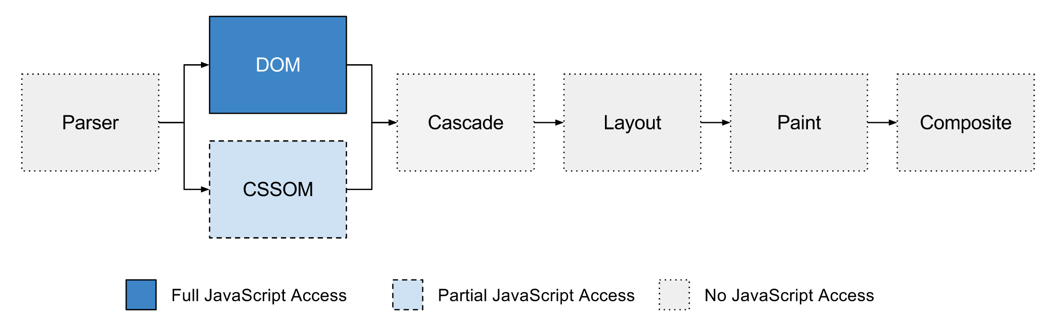
The picture is pretty bleak. As a developer, you have no control over how the browser parses HTML and CSS and turns it into the DOM and CSS object model (CSSOM). You have no control over the cascade. You have no control over how the browser chooses to lay out the elements in the DOM or how it paints those elements visually on the screen. And you have no control over what the compositor does.
The only part of the process you have full access to is the DOM. The CSSOM is somewhat open; however, to quote the Houdini website, it’s “underspecified, inconsistent across browsers, and missing critical features.”
For example, the CSSOM in browsers today won’t show you rules for cross-origin style sheets, and it will simply discard any CSS rules or declarations it doesn’t understand, which means that if you want to polyfill a feature in a browser that doesn’t support it, you can’t use the CSSOM. Instead, you have to go through the DOM, find the <style> and/or <link rel="stylesheet"> tags, get the CSS yourself, parse it, rewrite it and then add it back to the DOM.
Of course, updating the DOM usually means that the browser has to then go through the entire cascade, layout, paint and composite steps all over again.
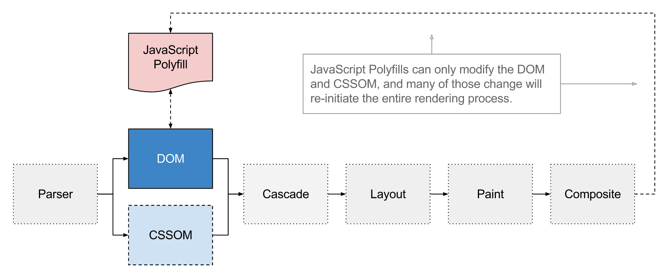
While having to completely rerender a page might not seem like that big of a performance hit (especially for some websites), consider how often this potentially has to happen. If your polyfill’s logic needs to run in response to things like scroll events, window resizing, mouse movements, keyboard events — really anytime anything at all changes — then things are going to be noticeably, sometimes even cripplingly, slow.
This gets even worse when you realize that most CSS polyfills out there today include their own CSS parser and their own cascade logic. And because parsing and the cascade are actually very complicated things, these polyfills are usually either way too big or way too buggy.
To summarize everything I just said more concisely: If you want the browser to do something different from what it thinks it’s supposed to do (given the CSS you gave it), then you have to figure out a way to fake it by updating and modifying the DOM yourself. You have no access to the other steps in the rendering pipeline.
But Why Would I Ever Want To Modify The Browser’s Internal Rendering Engine?
This, to me, is absolutely the most important question to answer in this whole article. So, if you’ve been skimming things so far, read this part slowly and carefully!
After looking at the last section, I’m sure some of you were thinking, “I don’t need this! I’m just building normal web pages. I’m not trying to hack into the browser’s internals or build something super-fancy, experimental or bleeding-edge.”
If you’re thinking that, then I strongly urge you to step back for a second and really examine the technologies you’ve been using to build websites over the years. Wanting access and hooks into the browser’s styling process isn’t just about building fancy demos — it’s about giving developers and framework authors the power to do two primary things:
- to normalize cross-browser differences,
- to invent or polyfill new features so that people can use them today.
If you’ve ever used a JavaScript library such as jQuery, then you’ve already benefitted from this ability! In fact, this is one of the main selling points of almost all front-end libraries and frameworks today. The five most popular JavaScript and DOM repositories on GitHub — AngularJS, D3, jQuery, React and Ember — all do a lot of work to normalize cross-browser differences so that you don’t have to think about it. Each exposes a single API, and it just works.
Now, think about CSS and all of its cross-browser issues. Even popular CSS frameworks such as Bootstrap and Foundation that claim cross-browser compatibility don’t actually normalize cross-browser bugs — they just avoid them. And cross-browser bugs in CSS aren’t just a thing of the past. Even today, with new layout modules such as flexbox, we face many cross-browser incompatibilities.
The bottom line is, imagine how much nicer your development life would be if you could use any CSS property and know for sure it was going to work, exactly the same, in every browser. And think about all of the new features you read of in blog posts or hear about at conferences and meetups — things like CSS grids, CSS snap points and sticky positioning. Imagine if you could use all of them today and in a way that was as performant as native CSS features. And all you’d need to do is grab the code from GitHub.
This is the dream of Houdini. This is the future that the task force is trying to make possible.
So, even if you don’t ever plan to write a CSS polyfill or develop an experimental feature, you’d probably want other people to be able to do so — because once these polyfills exist, everyone benefits from them.
What Houdini Features Are Currently In Development?
I mentioned above that developers have very few access points into the browser’s rendering pipeline. Really, the only places are the DOM and, to some extent, the CSSOM.
To solve this problem, the Houdini task force has introduced several new specifications that will, for the first time, give developers access to the other parts of the rendering pipeline. The chart below shows the pipeline and which new specifications can be used to modify which steps. (Note that the specifications in gray are planned but have yet to be written.)
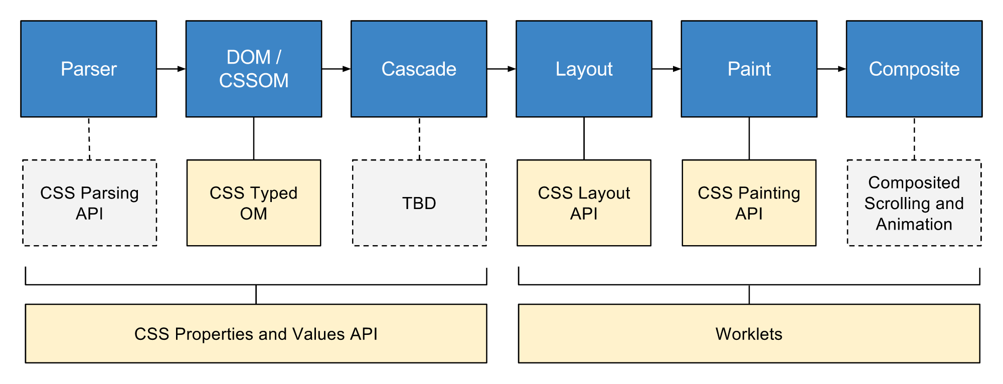
The next few sections give a brief overview of each new specification and what kinds of capabilities it offers. I should also note that other specifications are not mentioned in this article; for the complete list, see the GitHub repository of Houdini’s drafts.
CSS Parser API
The CSS Parser API is currently not written; so, much of what I say could easily change, but the basic idea is that it enables developers to extend the CSS parser and tell it about new constructs — for example, new media rules, new pseudo-classes, nesting, @extends, @apply, etc.
Once the parser knows about these new constructs, it can put them in the right place in the CSSOM, instead of just discarding them.
CSS Properties And Values API
CSS already has custom properties, and, as I’ve expressed before, I’m very excited about the possibilities they unlock. The CSS Properties and Values API takes custom properties a step further and makes them even more useful by adding types.
There are a lot of great things about adding types to custom properties, but perhaps the biggest selling point is that types will allow developers to transition and animate custom properties, something we can’t do today.
Consider this example:
body {
  --primary-theme-color: tomato;
  transition: --primary-theme-color 1s ease-in-out;
}
body.night-theme {
  --primary-theme-color: darkred;
}
In the code above, if the night-theme class is added to the <body> element, then every single element on the page that references the –primary-theme-color property value will slowly transition from tomato to darkred. If you wanted to do this today, you’d have to write the transition for each of these elements manually, because you can’t transition the property itself.
Another promising feature of this API is the ability to register an “apply hook,” which gives developers a way to modify the final value of a custom property on elements after the cascade step has completed, which could be a very useful feature for polyfills.
CSS Typed OM
CSS Typed OM can be thought of as version 2 of the current CSSOM. Its goal is to solve a lot of the problems with the current model and include features added by the new CSS Parsing API and CSS Properties and Values API.
Another major goal of Typed OM is to improve performance. Converting the current CSSOM’s string values into meaningfully typed JavaScript representations would yield substantial performance gains.
CSS Layout API
The CSS Layout API enables developers to write their own layout modules. And by “layout module,” I mean anything that can be passed to the CSS display property. This will give developers, for the first time, a way to lay out that is as performant as native layout modules such as display: flex and display: table.
As an example use case, the Masonry layout library shows the extent to which developers are willing to go today to achieve complex layouts not possible with CSS alone. While these layouts are impressive, unfortunately, they suffer from performance issues, especially on less powerful devices.
The CSS Layout API works by giving developers a registerLayout method that accepts a layout name (which is later used in CSS) and a JavaScript class that includes all of the layout logic. Here’s a basic example of how you might define masonry via registerLayout:
registerLayout('masonry', class {
  static get inputProperties() {
    return ['width', 'height']
  }
  static get childrenInputProperties() {
    return ['x', 'y', 'position']
  }
  layout(children, constraintSpace, styleMap, breakToken) {
    // Layout logic goes here.
  }
}
If nothing in the above example makes sense to you, don’t worry. The main thing to care about is the code in the next example. Once you’ve downloaded the masonry.js file and added it to your website, you can write CSS like this and everything will just work:
body {
  display: layout('masonry');
}
CSS Paint API
The CSS Paint API is very similar to the Layout API above. It provides a registerPaint method that operates just like the registerLayout method. Developers can then use the paint() function in CSS anywhere that a CSS image is expected and pass in the name that was registered.
Here’s a simple example that paints a colored circle:
registerPaint('circle', class {
  static get inputProperties() { return ['--circle-color']; }
  paint(ctx, geom, properties) {
    // Change the fill color.
    const color = properties.get('--circle-color');
    ctx.fillStyle = color;
    // Determine the center point and radius.
    const x = geom.width / 2;
    const y = geom.height / 2;
    const radius = Math.min(x, y);
    // Draw the circle \o/
    ctx.beginPath();
    ctx.arc(x, y, radius, 0, 2 * Math.PI, false);
    ctx.fill();
  }
});
And it can be used in CSS like this:
.bubble {
  --circle-color: blue;
  background-image: paint('circle');
}
Now, the .bubble element will be displayed with a blue circle as the background. The circle will be centered and the same size as the element itself, whatever that happens to be.
Worklets
Many of the specifications listed above show code samples (for example, registerLayout and registerPaint). If you’re wondering where you’d put that code, the answer is in worklet scripts.
Worklets are similar to web workers, and they allow you to import script files and run JavaScript code that (1) can be invoked at various points in the rendering pipeline and (2) is independent of the main thread.
Worklet scripts will heavily restrict what types of operations you can do, which is key to ensuring high performance.
Composited Scrolling And Animation
Though there’s no official specification yet for composited scrolling and animation, it’s actually one of the more well-known and highly anticipated Houdini features. The eventual APIs will allow developers to run logic in a compositor worklet, off the main thread, with support for modification of a limited subset of a DOM element’s properties. This subset will only include properties that can be read or set without forcing the rendering engine to recalculate layout or style (for example, transform, opacity, scroll offset).
This will enable developers to create highly performant scroll- and input-based animations, such as sticky scroll headers and parallax effects.
While there’s no official specification yet, experimental development has already begun in Chrome. In fact, the Chrome team is currently implementing CSS snap points and sticky positioning using the primitives that these APIs will eventually expose. This is amazing because it means Houdini APIs are performant enough that new Chrome features are being built on top of them. If you still had any fears that Houdini would not be as fast as native, this fact alone should convince you otherwise.
To see a real example, Surma recorded a video demo running on an internal build of Chrome. The demo mimics the scroll header’s behavior seen in Twitter’s native mobile apps.
What Can You Do Now?
As mentioned, I think everyone who builds websites should care about Houdini; it’s going to make all of our lives much easier in the future. Even if you never use a Houdini specification directly, you’ll almost certainly use something built on top of one.
And while this future might not be immediate, it’s probably closer than a lot of us think. Representatives of all major browser vendors were at the last Houdini face-to-face meeting in Sydney earlier this year, and there was very little disagreement over what to build or how to proceed.
From what I could tell, it’s not a question of if Houdini will be a thing, but when, and that’s where you all come in.
Browser vendors, like everyone else who builds software, have to prioritize new features. And that priority is often a function of how badly users want those features.
So, if you care about the extensibility of styling and layout on the web, and if you want to live in a world where you can use new CSS features without having to wait for them to go through the standards process, talk to members of the developer relations teams for the browser(s) you use, and tell them you want this.
The other way you can help is by providing real-world use cases — things you want to be able to do with styling and layout that are difficult or impossible to do today. Several of the drafts on GitHub have use-case docs, and you can submit a pull request to contribute your ideas. If a doc doesn’t exist, you can start one.
Members of the Houdini task force (and the W3C in general) really do want thoughtful input from web developers. Most people who participate in the spec-writing process are engineers who work on browsers. They’re often not professional web developers themselves, which means they don’t always know where the pain points are.
They depend on us to tell them.
Resources And Links
- CSS-TAG Houdini Editor Drafts, W3C The latest public version of all Houdini drafts
- CSS-TAG Houdini Task Force Specifications, GitHub The official Github repository where specification updates and development takes place
- Houdini Samples, GitHub Code examples showcasing and experimenting with possible APIs
- Houdini mailing list, W3C A place to ask general questions
Special thanks to Houdini members Ian Kilpatrick and Shane Stephens for reviewing this article.
Further Reading
- Why You Should Stop Installing Your WebDev Environment Locally
- The Future Of CSS: Experimental CSS Properties
- 53 CSS-Techniques You Couldn’t Live Without
- Getting Started With Neon Branching
 (al, vf, jb, mrn)

